I've been a big fan of Repl.it as it allows me to be able to fire up a nice Clojure REPL without a lot of grief or overhead, and it's fast enough for small projects, and while it's not perfect - like you can't include a real project.clj so you can't load other packages, it's still pretty nice.
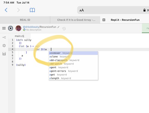
A few weeks ago, I noticed an odd little bug in the editor on Repl.it - the cursur wasn't where the actual insertion point was on the editor:

The more you had on a line, the more of a gap there would be on the editor. And it didn't matter if I was using the Desktop browser on my iPad, or the Mobile browser... on my iPad, it was off. And I tried a lot of things... reported it to the Bugs List for Repl.it, and while others had seen it - there were no answers.
Finally, I thought about the zoom feature.
On my iPadPro, for Repl.it, I like to zoom out a few steps to get more on the screen. I don't mind the smaller fonts - I can read them just fine, and it reduces the "dead space" on the screen quite nicely, so that I have a good editor window, and a nice REPL window.
So I went back to Repl.it, pulled up a saved REPL, and rest the zoom to "Original". Boom! The cursor and the insertion point lined up, and looked just fine. I then updated my Bug Report on Repl.it, and hoped that it was going to be a lot easier to reproduce for the developers - because I had a way to make it "Good", and then "Bad", and back to "Good". Repeatable 100% of the time!
It's been a few weeks, and nothing, so today I offered to help work on this, as I'd really like to have this fixed, and I'm sure others would too... but I may have to wait for iPadOS 14, and hope that Safari on iPadOS 14 is going to fix this behavior.
I'd be happy to help... because I'd really like it fixed before the Fall.


