Adding a Pseudo-Z-Axis to Scatter Graphs
Today someone stopped by and asked if there were a way to add a grouping, or filtering, capability to the scatter graphs that I have built atop the VantagePoint graphing system. In the Shop, we use these interfacial classes as they include applet frameworks so it's easy to include them in applications and applets, they represent a simplified user interface, while still allowing the user to dig into and grab the VantagePoint objects if required.
The functionality is basically this: have the user indicate a column in the dataset - numeric or alphabetic, and then generate a list of unique values for that column. Put those into a simple JList in the graph's GUI and then allow the user to select/de-select the values and in so doing, showing and hiding the values on the graph. For a concrete case, imagine there's a column that indicates the species of an animal, and the rows are a series of animals on a farm. Many will be duplicates (cows) because there may be specific data fro each cow, but there will also be chickens, and pigs, and dogs, etc.
By selecting 'cow' in the JList, the cow's data will be show in the graph. Deselect it and the cow data will disappear from the graph. Pretty neat. It's a good idea, and I needed to think for a while about how exactly to implement it successfully.
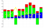
VantagePoint allows me to easily show/hide the individual labels on points, so that's easy. But when looking at the points on the scatter graph we're in a bit of a pickle. You see, the scatter graph is the intersection of two columns - one for the x-axis and the other for the y-axis. VantagePoint only allows for showing/hiding of complete columns. So if I try to hide one point, I hide the entire graph. That's not good, and there were no documentated ways to do this 'single-point' visibility.
Then I got the idea of painting the points white-on-white. VantagePoint allows you to color each data point differently, but the problem is there's a black border on the points, and I could not figure out how to change that color. Then I thought of the size. Bingo! I had a winner.
I could make the points that I wanted to hide very, very small, so small that they didn't even render. Then when I needed to show them again, I could draw them 'normal' sized. This was nice because I didn't have to remember the color of the point - I just had to change the size of a point from 'small' to 'normal'. Sweet!
I still had a little work to do on the order of graphical operation to keep the 'flash' in the update to a minimum, but I think I have that working just fine now. It's been an interesting ride, but I'm glad I stuck with it to get this done. It'll be a nice addition to the graphing capabilities of the graph.